Some time ago I suggested to Francis Irving that he apply principal components analysis (as used in my Political Survey and elsewhere) to parliamentary voting records. Francis very kindly sent me an enormous file full of data so that I could do all the work myself.
Some background is available at the Public Whip FAQ page; basically, from time to time Parliament divides (votes), and MPs who are present may vote `aye' (yes) or `noe' on the motion. There is no usual way for an MP to register an abstention (occasionally one may vote `aye' and `noe' in a single division, but this is rare and abstention and absence can't usually be distinguished). According to The Public Whip's statistics, the mean attendance in divisions is about 62%.
The simplest representation of these data is to consider each MP's voting record as a vector of all the divisions in which they voted. Each element of the vector is +1 if the MP voted `aye' in the corresponding division, -1 for `noe', and 0 for `not present', which could be the result of laziness, abstention, or the MP having better things to do with their time. (Tony Blair, for instance, rarely votes; Gerry Adams never does.) Note that the assignment of -1/0/+1 is arbitrary. Because many divisions are rather sparsely attended, I've restricted my analysis to divisions in which 500 or more (out of 659) MPs vote; this is arbitrary too, but has the effect of restricting the analysis to the to 15-25% of divisions with the largest attendance. These are likely to be the most controversial, and therefore interesting, divisions, since otherwise all those MPs wouldn't have bothered to turn up for them.
Anyway, given this set of vectors we can find the covariance matrix for the divisions, which tells us how the votes in one division correspond to votes in others. If every MP voted the same way in two different divisions, the covariance between those divisions would be large and positive; if every MP who voted `aye' in the first division voted `noe' in the second, the covariance would be large and negative; and if the votes in the two divisions were completely unrelated, the covariance would be about zero.
Principal components analysis picks out the combinations of the divisions which (in some sense) best explain the variations in the data. I wrote some notes about the procedure for the Political Survey; the procedure is the same here, except that instead of survey questions we have divisions. The idea is that we'll extract from the data political axes which describe how MPs behave.
The Public Whip has data from the 1997 and 2001 Parliaments. I've looked at both. The results are not earth-shattering, but they are somewhat interesting....
First, how many significant axes are there? I can't be bothered to do this properly (by sampling from marginal distributions), so instead here's what is apparently called a scree plot, a plot of the first few eigenvalues:
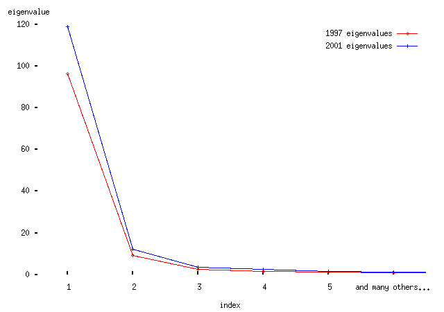
-- from this we conclude (by handwaving, basically) that the first two eigenvectors are significant. The first eigenvector is much more important than the second. We shall see why in a moment.
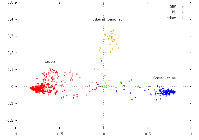
Plotting the data for the two parliaments yields the following. First, 1997:
and 2001:
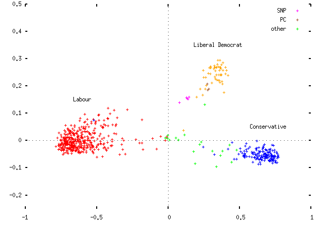
Observe that the MPs cluster by party affiliation. This is promising, and suggests that the whole thing may not be a total waste of time. (I've picked the signs of the x and y coordinates to put Labour on the left and the Conservatives on the right; obviously this is an arbitrary distinction.) Some comments:
- The horizontal axis is the most important (first) eigenvector; the vertical axis is the second. Each point represents an MP, coloured according to their party. The sole Conservatives in the middle of the Labour clouds are MPs who've changed allegiance and whose status isn't reflected in the data.
- The axes are scaled so that the largest possible coordinate on either is ±1. I haven't scaled the actual plot to reflect the difference in eigenvalues, but if I did it would be squashed vertically by a factor of about 3.
- The dotted lines represent where an MP who voted in none of the divisions in either axis would fall. The (0, 0) point in the center is where an entirely non-voting MP would fall.
- Because of this, each party's MPs are spread out between their party's cluster and the center of the plot, based solely on how often each MP votes. This is not helpful.
- As an aside, the `other' MPs are mainly the various brands of Northern Irish politicians. It turns out that on the plot UUP and DUP politicians are basically Tories, SDLP politicians are basically Labour MPs, and SNP and Plaid Cymru members are basically Liberal Democrats who don't vote very often. (I haven't plotted the various Northern Irish parties in separate colours, partly because I'd run out and partly because I don't know enough about Northern Irish politics to comment very intelligently on them, as the previous sentence probably indicates.)
The fact that MPs don't attend all votes is a pain, because it means we can't tell whether an MP lies outside the cluster of their party because they're a rebel, or because they're lazy. Two ways to fix this suggest themselves:
- Include the fraction of divisions in which each MP votes as an additional variable in the analysis. (Observe that this is, in fact, OK, because the voting fraction is linearly independent of all the other parameters.)
- Scale each MP's position on the plot by the fraction of divisions in which they vote.
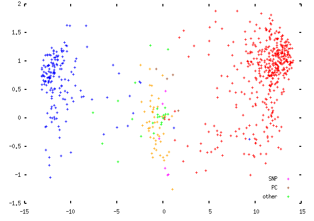
Both of these are ad hoc. The first one sounds more elegant, but in fact leaves the first eigenvector unchanged with the second eigenvector representing the voting fraction plus some noise. This produces a rather less interesting plot that looks like this: (these are data from the 1997 Parliament; the scaling is slightly different, but that makes no difference to the plot itself)
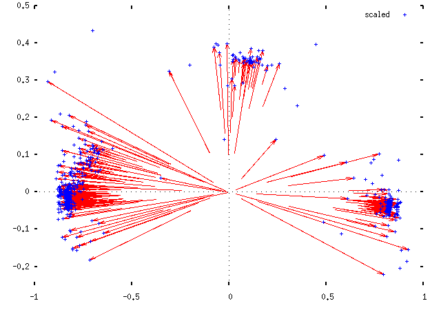
The second idea is easy to explain and hard to justify. We take each MP's position (x, y), and plot them instead at (x/f, y/f), where f is the fraction of divisions in which they voted. This should move them out towards the edge of the plot, to join their political fellows. Implicitly, this makes the assumption that MPs are failing to attend votes, rather than choosing to abstain: the scaling is moving them to the position that they would be in had they voted in all divisions in the manner suggested by their votes in the divisions they did attend. This is obviously not right, but it's not so catastrophically wrong as to be useless, either. Here are two views of the difference this makes for the 1997 Parliament data:
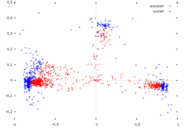
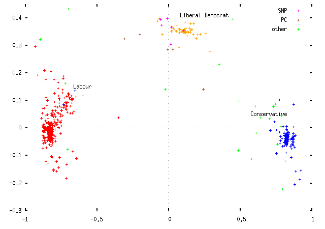
Applying this scaling, we get for the 1997 Parliament:
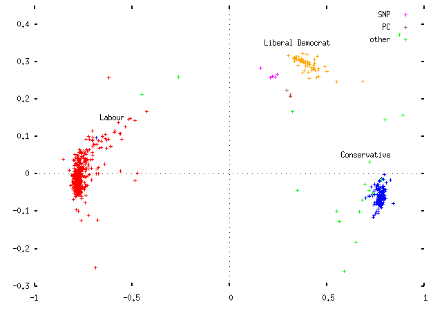
and for 2001:
Note that:
- The Liberal Democrats are centered on the first axis, and offset on the second.
- The Labour Party is centered on the second axis, and the Conservative Party very slightly offset in the opposite direction to the Liberal Democrats;
- The two largest parties take up positions opposite one another, offset on the first axis.
- There are no MPs in the position opposite the Liberal Democrats.
Before making any more comments, we should look at what the two eigenvectors mean. The two are quite different. Looking at the absolute values of the components -- that is, how strongly the votes in the various divisions contribute to an MP's horizontal position on the graph, we get this:
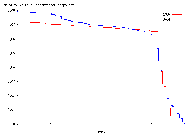
-- that is, the top 90% of divisions contribute about equally to the axis. Basically these are the divisions in which MPs from the Labour and Conservative parties voted on opposing sides; it is a `government/anti-government' axis. The majority of divisions are like this; typical examples include this division in which Conservative and Liberal Democrat members called for a Civil Service Bill, and Labour members opposed them; or this division on an amendment to the Criminal Justice Bill which was defeated by Labour.
The second one is rather different:
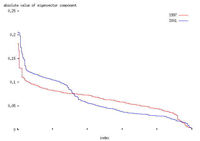
It is dominated by a few divisions in which the Liberal Democrats opposed both the Labour and Conservative parties. Typical examples include this division on the case for an invasion of Iraq, or this on the withdrawal of state support from the families of asylum seekers. Essentially this is an `axis of Lib-Demmery'.
The actual list of divisions and component strengths which make up the two axes are here:
-- there are links from those pages to the pages for each division at The Public Whip.
Although the divisions voted on in the two Parliaments are obviously different, the axes retain their meanings between the two. So we can compare the positions of the parties between the two Parliaments. Basically we find,
- In 1997, the Liberal Democrats were genuinely a center party: they voted for and against the government about equally often, so that they appeared right in the middle of the `government/anti-government' axis. But in 2001 they moved to the `right'; that is, opposing the government more often (or on more significant divisions) than supporting it.
- And the Conservatives have moved slightly further away from the Liberal Democrat position -- that is, moving down the plot to more negative values on the `axis of Lib-Demmery'.
These two points are consistent with Liberal Democrat strategy to move right better to compete with the Conservatives for votes in Conservative/Liberal Democrat seats. (Remember the `decapitation' strategy?) The change in Tory position is, I think, too small to say much about, but it's suggestive of another chapter in the endless Tory search for `clear blue water', except that here we're talking about separation from the Liberal Democrats, rather than those post-Thatcherites on the Labour benches. (And note that behaviour in Parliament is not interchangeable with policy as advertised to the public. The subjects of most divisions are chosen by the government, not the Conservative or Liberal Democrat parties; Opposition parties can't control the agenda in Parliament in the way they can in their manifestos and campaigns. So the waffle above should be taken heavily salted.)
Moving on,
- The rebellious `tail' of the Labour Party became more pronounced in the 2001 Parliament; and it also seems to be more coherent, stretching out towards the Liberal Democrats in a great arc. Before, the party was more clustered, and its tail more diffuse.
-
In 1997, the Conservative Party contained two quite distinct clumps; the rightmost of them contained 32 MPs, but it's not clear what they had in common. That group included among others Michael Heseltine, who famously `bought his own furniture'; Iain Duncan Smith, who later became leader; ex-minister Brian Mawhinney; alleged vulcan John Redwood; Bill Cash, the veteran Euro-sceptic; Edward Heath, the embittered leader from the 1970s; and Michael Colvin, who died in 2000. Their attendance at divisions varies from 54% in the case of Michael Colvin (who died in 2000) to almost 86% in the case of Duncan Smith, so the cluster doesn't seem to be an artefact of the scaling procedure. If somebody more familiar with the Tory party would like to tell me what these people have in common, I'd be much obliged. (The whole list is: Paul Beresford, William Cash, Michael Colvin, Patrick Cormack, Stephen Dorrell, Iain Duncan Smith, Peter Emery, David Faber, Christopher Gill, Teresa Gorman, Edward Heath, Michael Heseltine, Peter Lloyd, Brian Mawhinney, Patrick Nicholls, Owen Paterson, John Redwood, Andrew Rowe, Richard Shepherd, Caroline Spelman, Michael Spicer, Anthony Steen, Peter Tapsell, Charles Wardle, Bowen Wells, Shaun Woodward, Tim Yeo.)
In the 2001 Parliament, there was no such second clump.
- The Scottish and Welsh nationalists didn't move as far round as the Liberal Democrats did between 1997 and 2001.
It remains to say that there's a fair amount of handwaving in the above.
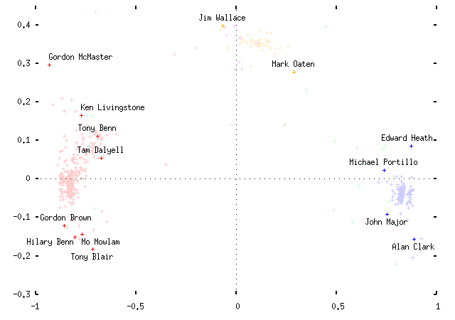
Another interesting exercise is to see where notable political personalities fall on the plot. Here are some examples, for 1997:
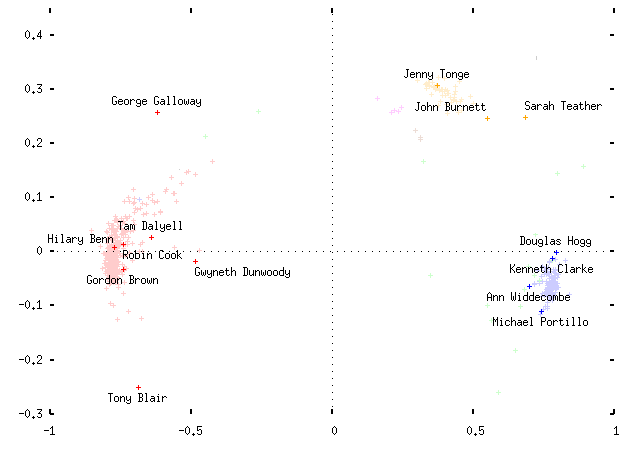
And for 2001:
If your browser supports Java, you can use Julian Todd's viewing applet to explore the data interactively, rather than just trusting me to pick MP names at random. Follow links for the 1997 Parliament; or the 2001 Parliament. (Disclaimer: I don't really do Java. So you're rather on your own with these. I don't have a browser which does Java, but the `appletviewer' tool from the Java development kit seems to do the right thing.)
I'm not sure how useful any of this is as a way to look at MPs' voting records, but it's vaguely fun and seems to be novel. Drop me a line if you can think of any interesting ways to use the data. Hopefully Francis and Julian will implement this for their MP map....