Continuing on the general theme of nuclear doom, I happened to come across in my notebook somebody's (I can't remember whose, I'm afraid) suggestion to draw a diagram of the movements of the Doomsday Clock displayed on the masthead of the Bulletin of the Atomic Scientists to remind readers that the world might be blown up at any moment. (The magazine itself is well worth reading. It's not all on the web, sadly, but a good selection of the articles is.)
For those who haven't seen it before, the clock is intended as a visual metaphor for the peace of the world.
At midnight, the keys are turned, the missiles are loosed and everyone dies. Before midnight, we're safe, more or less; but the later the hour, the closer lies incineration. The clock started off at seven minutes to midnight, and has never shown a time earlier than seventeen minutes to. This should probably tell you that the Atomic Scientists themselves aren't particularly sanguine about our ability as a species to resist blowing ourselves to pieces now that we're in a position to do so. It stood at two minutes to midnight during -- in their estimation -- the worst part of the Cold War, from 1953 -- after the first Soviet hydrogen bomb test -- until 1960, when things began to thaw a little. (There's a potted history of the clock from the 1995 issue of the Bulletin which summarises better than I do. The only other thing to note is that the clock isn't intended to reflect fast-moving events like the 1962 Cuban missile crisis or the 1983 `Able Archer' near-cock-up, but rather the general condition of international relations.)
So to the picture. The dotted line is midnight:
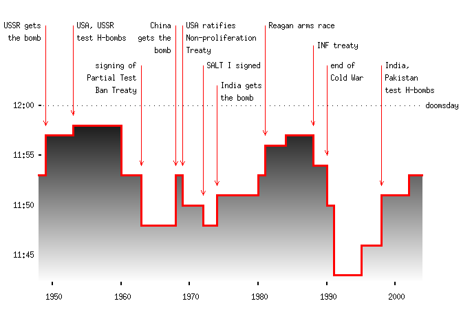
I'm not sure how much this tells us, but in its way it's a nice summary of trends in the Cold War.
(Oh, and I suppose it tells you that, like other web loggers, I'll occasionally post stuff which is more than usually content-free. As an aside, I don't think Tufte would approve of the shading on the above graph -- it worsens the ink-to-data ratio -- which is intended to suggest the sense of the vertical axis. Darker is worse, a common if ethnically inappropriate convention. Graphic design suggestions gratefully received....)