So, for today's slightly eccentric data exploration, we turn to something which Marginal Revolution, an economics 'blog, quoted a little while ago:
One crude measure [of migration between US cities] is to examine the one-way rental rates for U-Haul vans.
U-Haul is a truck, van and car rental company. Their website will quote you prices for one-way trips between (I presume) any pair of US cities where they have branches. In this specific case, Andrew Roth found that the hire of a 10' truck for a journey from Los Angeles, CA to Las Vegas, NV was, at $454, almost four times as expensive as the rental for the converse trip ($119). The inference is that U-Haul adjust their pricing to demand; and that people are moving from LA to Las Vegas at a much higher rate than from Las Vegas to LA. (He wanted, I think, to make an inference about the effects of different states' marginal tax rates.)
What happens with some more data points? Well, naturally, the first thing to do is to write a scraper for the U-Haul web site; unfortunately, when they come to give you a quote for the rental you're after, the actual price is presented as a little PNG image on the web page, rather than text (this at least suggests that somebody thinks the data are valuable!); happily, they don't do it very well, so gocr can extract the numbers, more-or-less. As another tangential observation, the U-Haul website is plenty slow, but arguably that's their own stupid fault for using Microsoft `Windows'.
Anyway, considering a fairly arbitrary selection of large US cities (New York, San Francisco, Houston, Chicago, Washington DC, Detroit, Phoenix, Denver, Jacksonville, Seattle, Las Vegas and Memphis, if you must know), we get data that look like this:
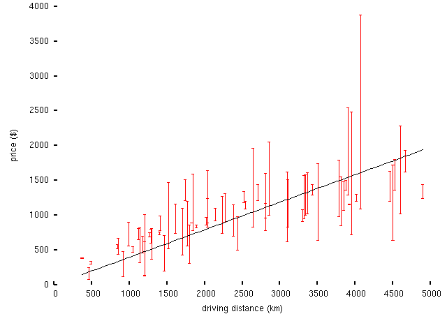
-- the vertical bars connect the prices for different directions between each pair of cities; I've used driving distances as computed by the Google Maps route planning thingy, but in fact the result isn't any cleaner than plotting the data against great-circle distances. (Though as a trivial factlet, here's driving distance vs great circle distance for the same set of cities:
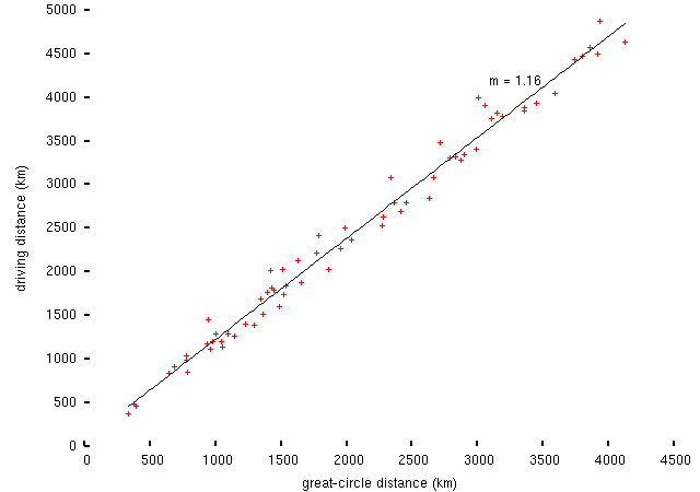
-- within this sample, the US road system typically enables point-to-point travel at a ~16% penalty over the best possible route. Without seeing a comparison with other countries, it's not clear whether that means that the Americans have too few roads or too many, and anyway there are probably better ways to address this question.)
I collected these data at the beginning of September, asking for quotes for trucks available on the seventh, i.e. today. I don't know how much Hurricane Katrina will have affected this -- presumably everyone who was able and willing to evacuate did so before the storm arrived, but perhaps many people would have planned to return home around now. U-Haul presumably are in a position to adjust their prices more-or-less in real time. Of these, prices to and from Houston are most likely to have been affected.
Obviously the idea here is that if the journey from A to B costs lots more than the journey from B to A, there's a net flow from A to B. Working backwards, the assumptions have to be something like: each U-Haul outlet sees a monotonically-decreasing demand curve for journeys to each other U-Haul outlet; there is some fixed supply of trucks, and U-Haul are keen for them not to all pile up in one place; so they adjust the price for the journeys in each direction to obtain equal numbers of journeys being executed in each direction, while (hopefully) making money on each truck's round-trip. This looks sort-of plausible from the distance/price plot above; unfortunately, without knowing what the demand curves look like or what U-Haul's policies are (maybe there are some default assumptions here? dunno what they are, though), we can't get too much further.
However, we ought to be able to get some information about the relative size (in the sense of ranking rather than proportion) of the flows between different city pairs. (Except, of course, that depends on some assumptions about transitivity which probably don't hold. Ho-hum.) One important issue here is that the condition for one journey costing significantly more than its return is that the condition should be independent of distance (since otherwise the results would be biased by the distances). Though the difference between high and low prices doesn't have this property (it increases with distance) the ratio of the two prices looks more useful:
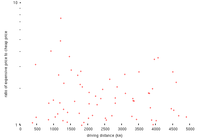
By this measure the top ten migration routes in this data set are,
... and on a map, this looks like this:
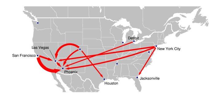
(Update: as Adam points out in the comments, I'd mixed up Detroit and Chicago on the original map. Oops. Also corrected an error in the table, above.)
(Why ten? Because with much more than that, the map gets unwieldy.)
So, what does this tell us? Specifically, it tells me not a whole lot -- beyond astonishment that people want to move to Las Vegas -- because I don't know much about the geography of the United States. (The results mostly fit the hypothesis that lots of people are running away from `rust-belt' states to get to `sun-belt' states.) But maybe some of my half-dozen readers will have something more useful to say....
(If anyone wants to play with the data, here are: prices.csv, the price data; distances.csv, the driving distances between the cities; and coords.csv, geographical coordinates of the cities. The screen-scraper is linked above.)